The Shining
The Shining,
released in 1980 and directed by Stanley Kubrick, is a film about how vast
isolation can drive a person into insanity and torment an individual’s mind. It
tells the story of writer Jack Torrance and his family who are caretakers to
the Overlook hotel over the winter break and Jack’s slow descent into insanity
which eventually leads to acts of terror and violence towards the ones he
loves.

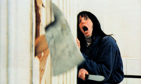
Figure 1. Hysteric
(c1980)
The props in the film are used to unconsciously unsettle the
viewer. The film switches props mid-point in scenes for example the same object
but of a different size and colour or by the props appearing in one scene, not
being there in the next but reappearing afterwards, which might also be a way
to express that the un-natural nature of the hotel, but could also express a
sudden character change in mood or opinion. As Kimpton states: “Yet
the scariest thing about The Shining is how it always plays with your
perception. (…) in a precursor scene in
the same Colorado lounge, when Jack tells Wendy not to disturb him when he is
writing, the typewriter changes from a small white model to a large grey one,
and a chair in in the background disappears, reappears and disappears. The film
is full of other object and hotel layout anomalies which subconsciously cause
us disquiet. They simply cannot be continuity errors from a director so well
known to be painstakingly meticulous.” (Kimpton, 2014:2)
The film often
uses a filming technique which is referred to as steady cam which steadies the
picture while the cameraman is taking the shot which allows for very long shots
without the camera shaking up and therefore giving the ability for the
directors to create quite unique shots and scenes, for example the distant
girls, a long shot scene where we are almost looking through Danny’s eyes and
seeing a very un-nerving far off sight. There are also several scenes where the
camera is used for dramatic affect for example the camera being close to the
character in many scenes which is perhaps used to create the feeling of the
viewer being caged together with the character creating a feeling of further
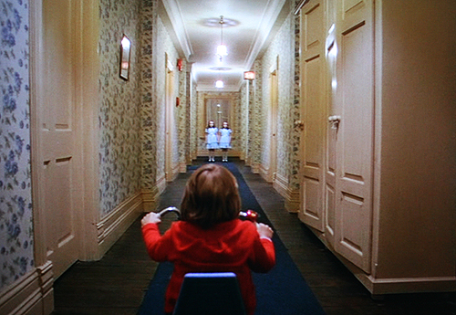
tension. Haruvister writes: “The bit that encapsulates Kubrick's genius, for me, is when Danny is on his
tricycle, about to face the Grady sisters. We've been following close behind
him all this time, and suddenly Kubrick's roaming camera stops, as if afraid.
When we cut to Danny again, we're no longer following, we're actually attached
to his vehicle. No escape.” (Haruvister, 2014:2)

Figure 2. Danny
with tricycle (c1980)
Colour is used subtlety in the film to emphasise situations.
Red seems to be used a lot during moments of hallucination and fear. The red
doors of the elevators, the red bathroom where Jack has a hallucination, red
appears in a lot of core moments to almost indicate something surreal is occurring
on set. Red is a bold colour that stands out, used in many cultures to portray
acts of madness and violence, perhaps this is what the directors are trying to
emphasise with the use of this colour.
Green is used in a less symbolic but more direct way, it is
worn by the ghost in the bathroom of 237, which is painted in green, and who at
first appears healthy and young but then reveals sickly green patches all over
her body and her true age, which might be a symbol for Jack’s progressing
sickness of mind which eventually leads to acts of intense violence towards
those he loves.

Figure 3. Room 237
(c1980)
Sound is used effectively in this film in times of no music
a different sort of soundtrack is used, a growing sound in the back of things
that builds and builds to the point of action where a character either sees
something horrifying or something horrific occurs. An example of the growing
volume of a high pitched sound can be found in the scene where the wife is
looking for Jack but cannot find him only to suddenly see walls covered in writing
confirming her worst fears that her husband has lost his mind. Ashley Clark
states: “Even more chilling is the sound design, a deeply
unsettling contrast of dead silence and piercing noise.” (Clark, 2012:2)
The sound track is also used to compliment anticipation and
anxiety for example a very shrill high pitched sound is played whenever
something supernatural or unexpected is about to happen like the child having visions
of the girls and floods of blood, the fathers further descent into insanity coupled
with hallucinations of parties that cannot happen in an empty hotel as well as
the wife’s hallucination being further emphasised with the haunting soundtrack
giving the viewer a much higher form of dread. The soundtrack is a core feature
of the film, it is used subtlety and boldly to emphasise moments of terror and
fear as well as to portray the emotions of the characters and the direness of
the situations they are facing.
Altogether, The
Shining combines all the elements of camera, props, colours and sound to
create a very intense horror film that is still being discussed today and has
left a footprint in film history. The combination of multiple affects creates a
film that is both compelling and terrifying to watch.
Bibliography:
Clark, Ashley. (2012) http://www.littlewhitelies.co.uk/theatrical-reviews/the-shining-22374
(Accessed on 27/22/2014)
Kimpton, Peter. (2014) http://www.theguardian.com/film/2014/oct/24/the-shining-the-film-that-frightened-me-most
(Accessed on 27/22/2014)
Haruvister. (2014) http://www.theguardian.com/film/2014/oct/02/the-shining-stanley-kubrick-jack-nicholson-review-1980
(Accessed on 27/22/2014)
Image List:
Figure 1.
Kubrick, S. (1980) Hysteric. [Still of Wendy] Available from: http://img2.wikia.nocookie.net/__cb20140512045448/stephenking/images/e/e4/The-Shining-010.jpg
(Accessed on 27/22/2014)
Figure 2. Kubrick,
S. (1980) Danny with tricycle. [Still
of Danny] Available from: http://www.toddalcott.com/wp-content/uploads/2010/12/sh_satbw4.jpeg
(Accessed on 27/22/2014)
Figure 3.
Kubrick, S. (1980) Room 237. [Still
of room 237] Available from: http://ktismatics.files.wordpress.com/2011/04/shining-bath.png
(Accessed on 27/22/2014)


