Showing posts with label Concept Art. Show all posts

Friday, 8 April 2016

Adaptation B Artwork


from the front with sail

 
from the front without sail
from the back without a sail

Some drawings from the front and back and without a sail as the sail covers the mast and deck on the back of the ship to envision the concept better.

Saturday, 2 January 2016

Character Project Environment concept art

This environment is a heavily corrupted place the heroine visits and seeks to cleanse. The theme of corruption is green as it is like a disease that hangs in the air. I gave the sky a glow to indicate the source. The player is looking down upon a valley.

Sunday, 15 March 2015

3rd Piece of Concept Art - Fantastic Voyage

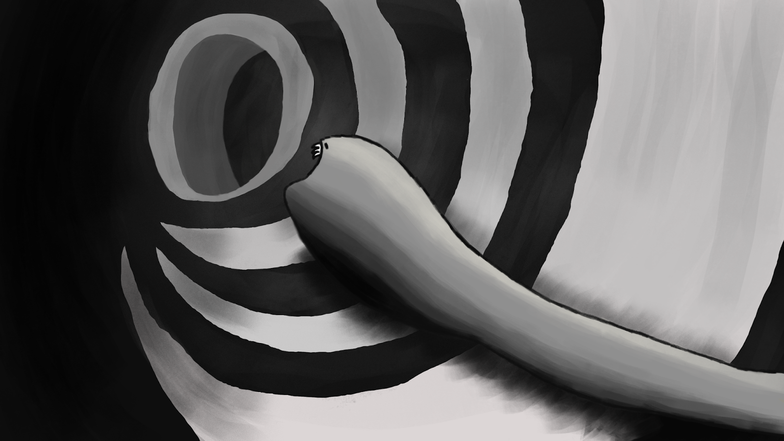
This took me all day long and is meant to be the inside of the lungs!

Fantastic Voyage Concept Art

 As my animatic and animation will be in black and white my concept art is, too. Especially the first one looks like an ink drawing to me, I used to do them about 10 years ago (fairly close to my chosen age range of 10-12/13!)
It's late but I can't sleep so I might as well put my time to use :p
These are my first two concept art pieces and I will do one more tomorrow, then all I have left to do is put it all together for Monday! I don't feel so horribly under-prepared anymore!

Sunday, 15 February 2015

Characters Concept Art FSTS


Have tried to improve on line art and details when designing my characters, I've kept Shannon as imaginative compared to the human character as a sort of transition into surrealism as we follow the piano key. I stole the circle idea from Da Vinci, I hope he won't mind! :)

Props Concept Art FSTS


Piano key and Piano, again trying to move to a more realistic style.

Concept Art Scenes FSTS


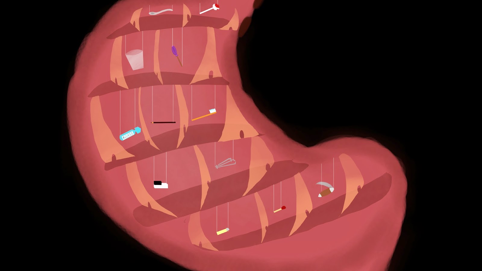
My revised scenes for FSTS, Have tried very hard to move my style on to a more realistic concept. Mouth took a loooong time! Was a very romantic valentines! :D


Wednesday, 4 February 2015

Monday, 24 November 2014

Concept Art!


I have done some more improvements on my concept art after talking to Jordan and also have a better idea now how the orthographics should look like! Lots of  work to do this week!

Sunday, 23 November 2014

Concept art improvements


This morning, I already went from this


To this


First I got rid of the loaf of bread on the right from the picture mentioned in earlier posts and substituted it with a building from the back, but I realised that by adding two buildings to the back of that one overcrowded the picture a bit so I took the pink/purple one on the far left out and put the new dark blue green one there instead, but it might balance the colours a bit too much now...
I quite like the sky now, I followed Phil's advice to use horizontal brush strokes and added some clouds with the Kandinsky way of putting white at the side where the light is coming from but I'm also worried it takes too much attention from the buildings so may have to tone it down a little, maybe green clouds wasn't the best choice or I just lighten them up to make them blend better.

Wednesday, 19 November 2014

Final Concept Art?

I took one of the buildings from the mid-ground forward!

New Concept Art for The What If Metropolis

It's not mirrored anymore :)
Obviously the Digital Sets have changed now so the detailed modelling plan looks like this:

More Concept Art!

This time I have enhanced the size of the most important buildings to put them into a better perspective with the whole picture.

Concept Art Update

I have updated the concept art a little by adding stronger tonal ranges, the foreground should stand out more while the background blends better with the skyline.

What If Metropolis - Concept Art

This is my final piece of concept art (for now) if there is anything fundamentally wrong with it please say asap :p I made the brush strokes as visible as possible and used the bold colours Kandinsky is famous for, tried to make the shapes interesting and eye catching but still looking like they could be lived in.